In March 2020 the New York State Governor's office put out a call for tech companies to support them in addressing challenges from COVID-19. One of the challenges was an overwhelming need for social safety net services, like unemployment assistance and housing vouchers.
As part of a team of 10 Google.org Fellows, I led the UX for a new web experience to help quickly match residents with the services they need.
In just three months, our team—most of whom have never met each other in person—went from zero code to an open source product ready for release. The web app is live at findservices.ny.gov.
The problem
We started by meeting with NY State agencies to understand the challenges they were facing. The most pressing issues the state was seeing were:
Dramatic growth in unemployment claims
1200% increase in daily active users on Department of Labor website
Spikes in applications to SNAP (or food stamps), temporary cash assistance, and housing support
We decided we could make the most impact by improving access to social safety net services.
I guided my team in coming up with the following problem statement:
How might we help NY State residents in need quickly discover relevant social services and next steps?
Research
“We need to remember the psychological part of the application, and the resident’s stress and trauma. They usually say ‘I need help,’ but don’t know what they need until they sit down with a benefits examiner.”
We started by understanding how NY State residents access social services today. I partnered with a UX researcher to conduct user interviews with benefits examiners (state employees that help residents complete social service applications) to understand the challenges residents face when they search and apply for services. We learned that often residents aren’t aware of the many programs they’re eligible for, and they may perceive a stigma around receiving assistance.
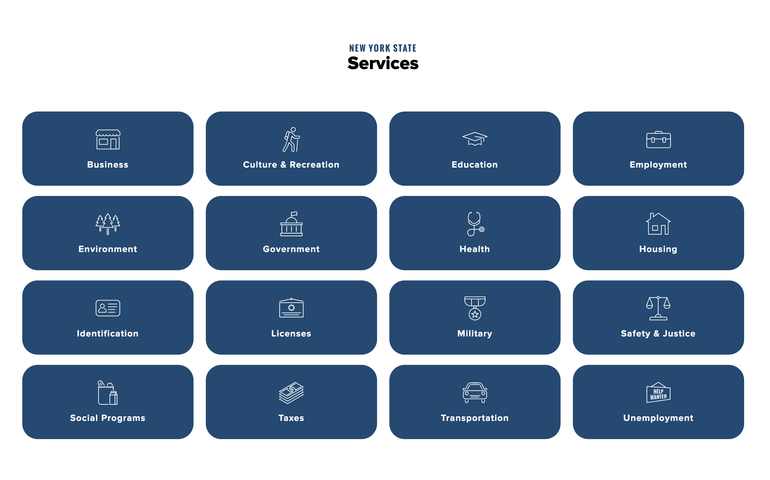
The ny.gov website had another set of challenges. The Office of Temporary and Disability Assistance offers the most social services, but some services are offered by different agencies and each agency has its own website. There was no unified way to see all of the services you might be eligible for.
Navigation to NY State’s services on the ny.gov website
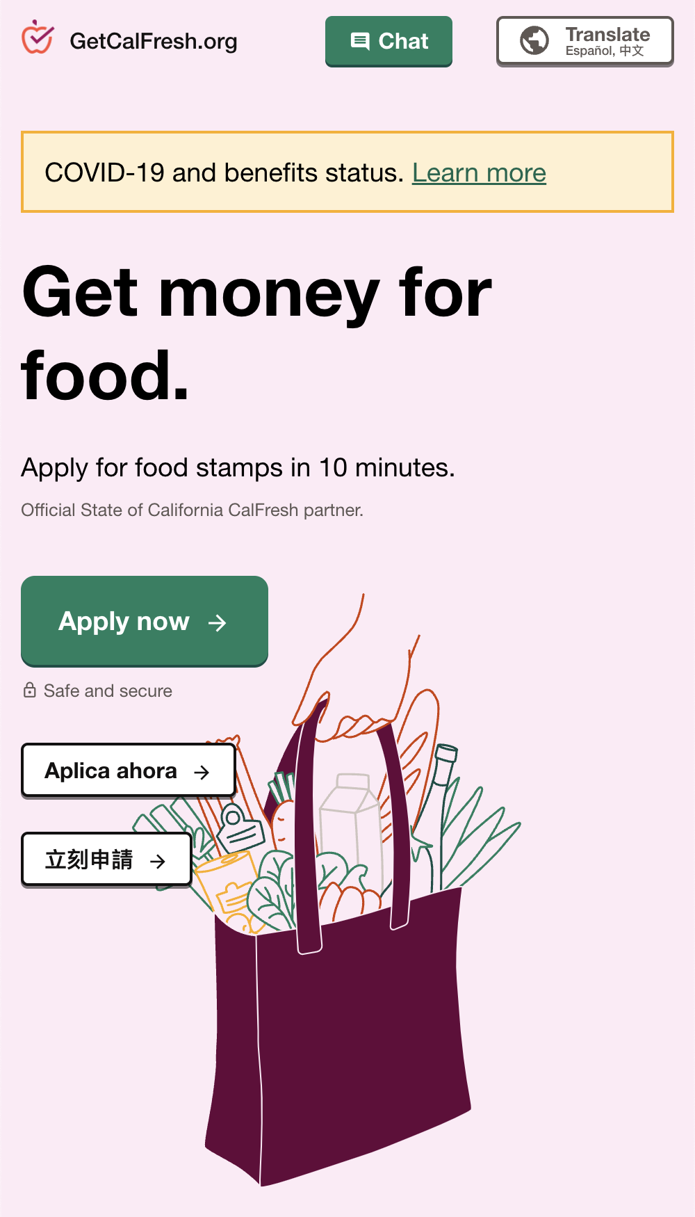
I also performed an audit of other tools that connect users with social services, such as ACCESS NYC, State of Michigan Bridges, and GetCalFresh.org. I noticed key themes such as the user flows took a few minutes or less to complete, were written in simple english with no legal jargon, and were mobile-first.
Screenshot of ACCESS NYC’s homepage
Screenshot of the landing page for GetCalFresh.org
Between the benefits examiner interviews and developing other research work streams, our UX researcher had a lot on their plate. As the UX lead, I brought on two additional part-time UX researchers to help out, as well as a part-time visual designer to ensure our work followed NY State’s design system and branding guidelines. I led weekly UX team meetings, set priorities for the UX team, and created UX report at the end of the fellowship with research learnings, design guidelines and future feature ideas.
Based on the research, we knew we wanted to build a unified, mobile-first way for NY residents to find the social services they were eligible for and next steps in applying for those services.
User Flow
-

The resident’s journey starts on ny.gov. Once the resident taps “explore services” they’re asked a series of questions.
We user tested multiple names for this experience such as “Relief services for you” and “Helpful services”. When we tried “Lifeline services,” we found the phrase was intimidating. One participant told us: “A lifeline insinuates that you're drowning. I'd like to see something a little more approachable."
-

One of the biggest UX challenges was finding the balance of asking the least number of questions, while gathering enough information to show meaningful results.
UX Writing was also a critical piece of the design - English is not the first language for a lot of residents, and our government stakeholders asked us to include a lot legal jargon in the experience. We tested many iterations of the copy to ensure the right tone and reading level.
-
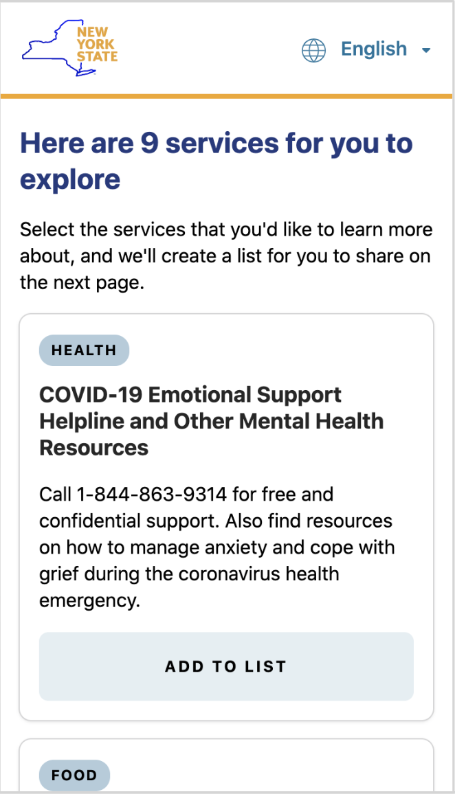
Once the resident has answered all of the questions, they are shown a handful of services they can explore. They can quickly review each service and add the ones they want to learn more about to their list.
-

In that list, they can see all the information they need to get started.
We heard in research that residents are often not ready to apply to a service in one sitting, so we've given the ability to email, print, or share the list.
Privacy is a concern for users when sharing information with the government, and especially sensitive information around COVID-19 status and income. We intentionally did not collect any PII (Personally identifiable information) from the resident throughout this flow to help alleviate these concerns.
Also our goal from the beginning was for this to be inclusive product, so this flow supports New York State's 7 core languages and we accounted for accessibility workflows early on in the design process.
Rapid usability testing
After designing the first iteration of the experience, I partnered with our UX researcher to set up a rolling research program. Each week I would create/update a clickable prototype, and our UXR used Validately.com to test it with actual residents. This was helpful to improve the product, but also a learning experience for the NY State employees who were able to observe the research sessions.
“I didn't even know that these things existed, so this is super helpful...I’m probably going to go on this website later myself!”
— Research participant
Beyond the fellowship
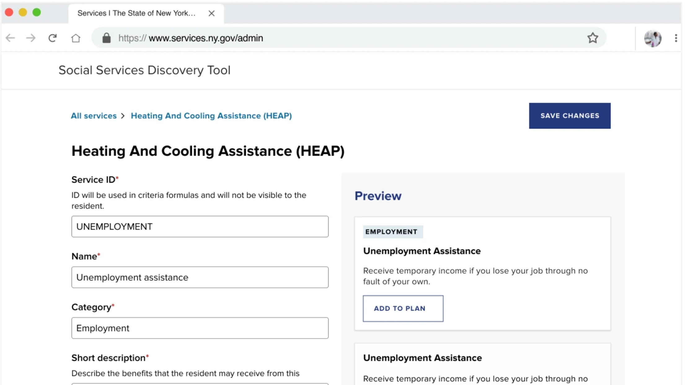
It was extremely important to our team that the tool would continue to be useful and stay up to date after the fellowship ended. We built an admin tool on the backend so the State can easily update or add new services without making any code changes. I created the designs for the admin tool in parallel to the user facing app.
Both the frontend resident experience and admin tool are also open source, with the hope that other states and civic organizations will find the tool useful and implement it for their residents.
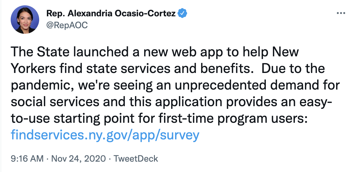
The Find Services App launched on Sept 22, 2020, and within two weeks had over 100,000 users complete the flow. There was a concerted marketing effort to spread awareness of the tool, including tweets from government officials and a Google Keyword interview about my experience.
But even more impressive was that we were able to build and launch this product in less than three months. This collaboration showed me the power of the public and private sector coming together and using technology to create equitable access to critical resources. Try the experience for yourself at
