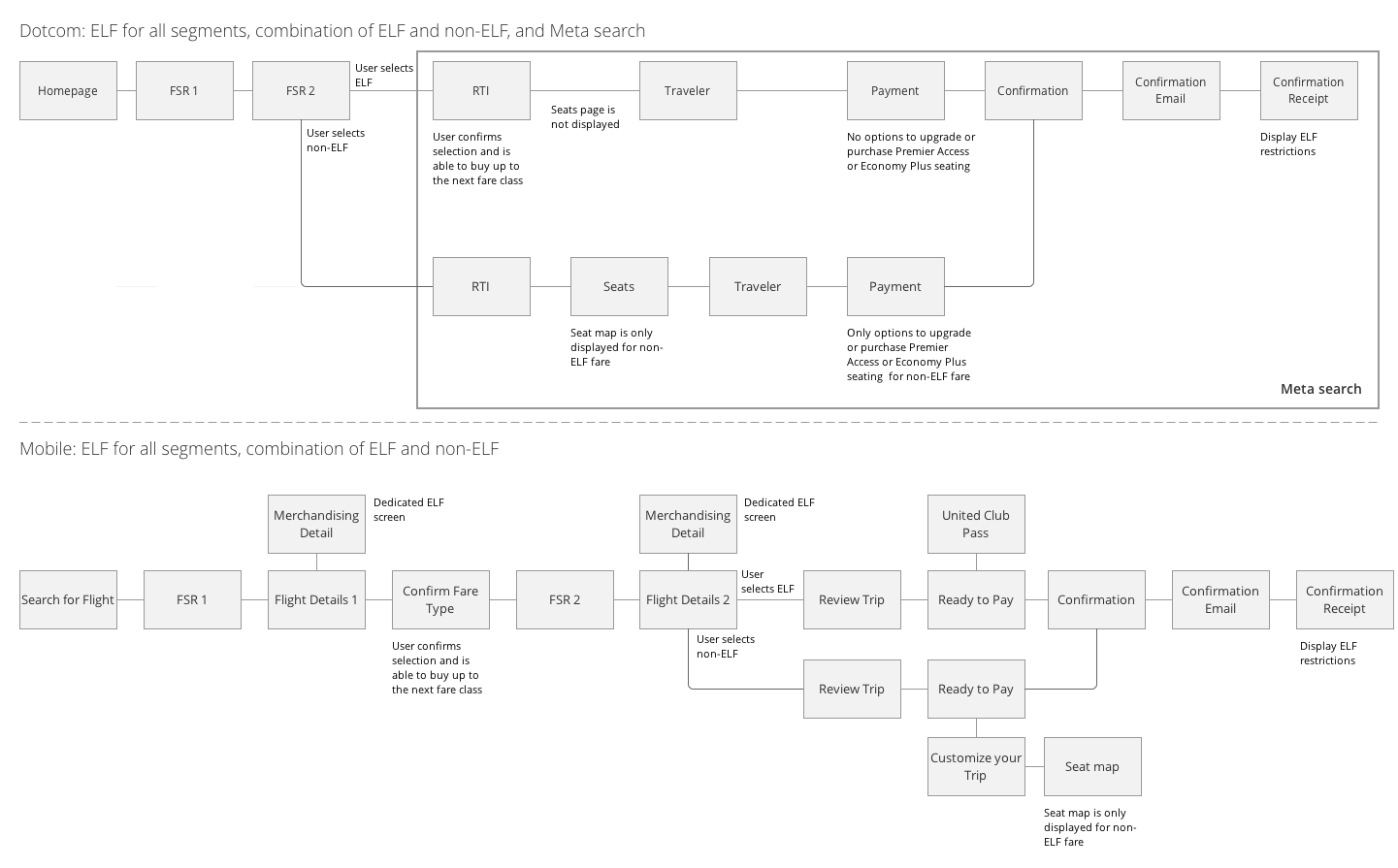
Basic Economy is a fare class designed for travelers that are willing to give up certain amenities such as seat selection and flight changes, to save money. Because of the unique restrictions on the product, integrating it into United's existing fare classes proved to be a technical and UX challenge.
Basic Economy is also United E-commerce's first Agile project. As the lead designer, I created the end-to-end experience for users through wireframes, user flows, comps, prototypes, and more. I worked closely with the product manager, QA team, and engineers to create the best product while advocating for the user.
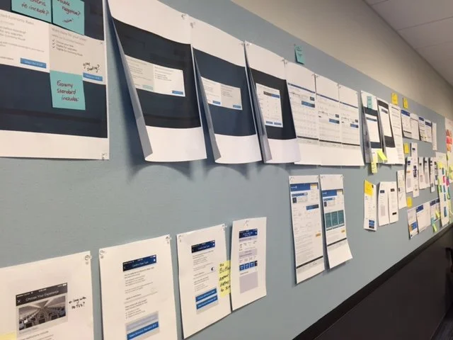
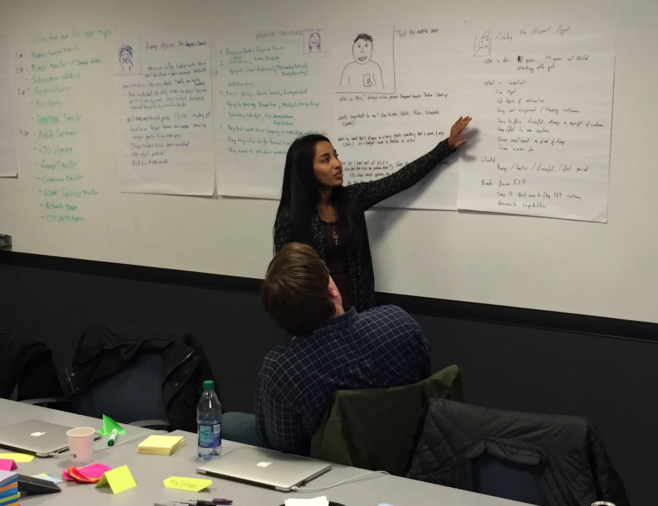
I worked with a cross-functional team to identify all the potential user stories to be executed in 2-week sprints. The team consisted of myself, 1 product manager, 1 business analyst, 2 QA resources, and several engineers representing different code bases and teams. I created a "mockup wall" so that I could easily walkthrough the Basic Economy journey and share updates to the design.
Each sprint involved daily standups, desk checks with engineers, and 24-hour video conferencing with our IT team in Houston. As a team, we mapped out dependencies and prioritized each user story in terms of importance for launch; I made sure to play a vocal part in prioritization so that the user's voice was represented. The project was estimated to run for 12 sprints.
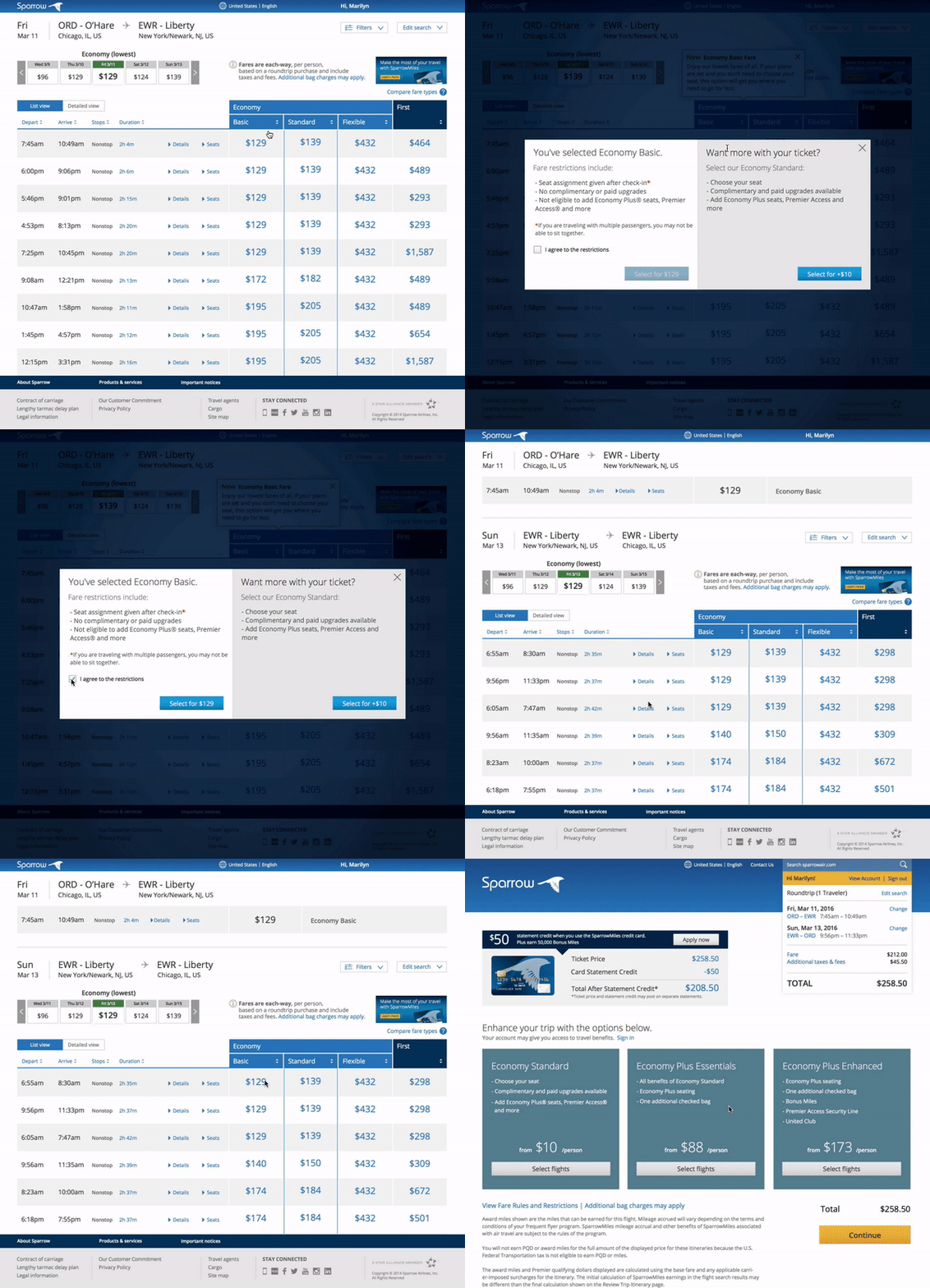
I built prototypes in Axure and Invision for usability testing with real United customers. The sessions were invaluable in gauging user comprehension of these new fares and their restrictions, and after each round I incorporated feedback into my designs. Below are the prototypes for two aspects of the experience - Decision Modal and Fare Comparision.
Decision Modal
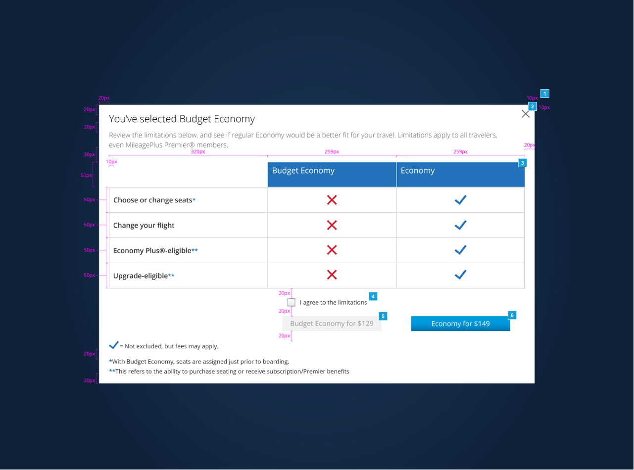
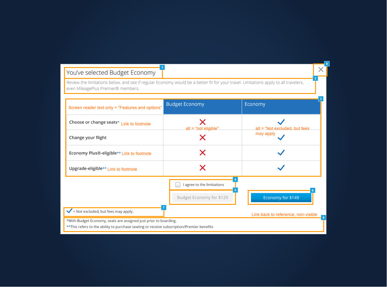
After the user selects a Basic Economy fare on the outbound flight, a decision modal appears. The goal of this modal is to explain the restrictions of Basic Economy while presenting an upsell opportunity.
Some of the main considerations in this design were copy, layout of the modal, and relative vs. absolute pricing on the button labels. We also put a lot of analysis into the necessity of the checkbox. Below are some of the my deliverables for this design: the first image represents the design with accessibility notes and the second shows redlines.
Fare Comparison
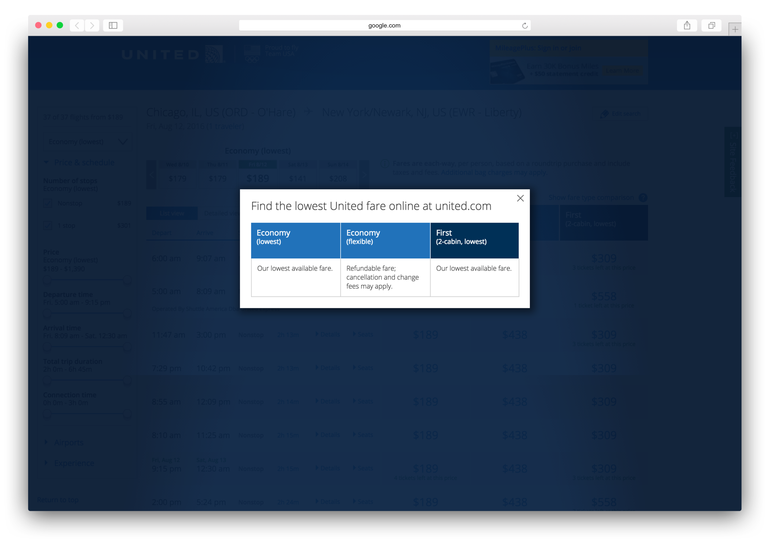
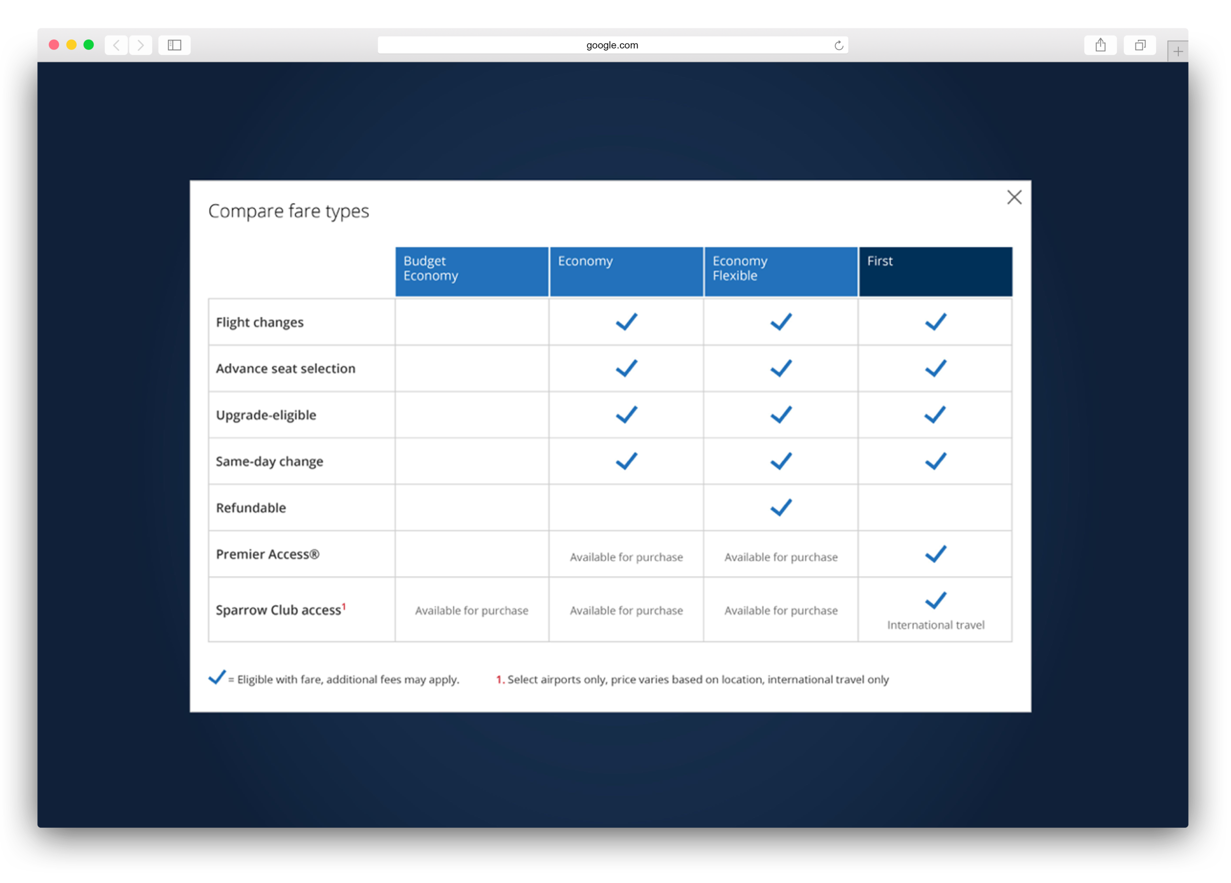
Another modal in the design was a the fare comparison. The user can access this modal from the flight shopping page to see the differences between fare options. Since we were adding a new fare type with this project, I thought it was critical to implement this design to help users make a clear and informed decision.
The image on the left is the current state fare comparison - clearly not the most helpful content. The image on the right shows the design that I proposed.
Basic Economy was United's first e-commerce project to launch working code in a shareable environment within 2 weeks - something the team was very proud of! The product is currently available on the site in certain markets.
